Marta Blue photographic series have been published by Penguin Random House, Domus, LensCulture, Elle Decoration, AD, Huffington post, l’Espresso, Nasty magazine and FreshEyes. Her photographs have been exhibited in festival and galleries, including PhotoFairs Shanghai, Les Rencontres de la Photographie Arles, Paris Photo, ArtBasel, and Tbilisi photo festival. She’s currently an art director and photographer.
What did you do yesterday?
During this time I am totally absorbed in my work.
Which camera do you usually use for shooting?
Canon mark|| and yashica t3.
How would you define your work?
Experimentation.
What is one fun fact about you?
I don’t have a sense of direction, I can get lost in my neighborhood too.
Do you have any art or photography influences who have informed your aesthetic?
I’m very influenced by cinema, but also by contemporary artists like Alex Prager and Gregory Crewdson
How did your career as a photographer begin?
It started as a game, there was no intention of being a photographer, and it still isn’t. I cannot label my work, I am aware of the fact that I am an extremely creative but introverted person, and that at the moment photography is the best way for me to communicate.
Favorite movie and why?
I don’t have a favorite movie, but I’m very attracted to David Lynch’s art.
What was the turning point in your career?
I think the turning point came after winning the Lensculture Award, as an emerging talent, two years ago.
How would you describe your connection with the camera when you are shooting?
Accurate. I hardly try to capture the moment, rather I try to create my own
What is your secret ingredient to take a satisfying photo?
No fear.
The project Darkness is colorful is a collection of emotions, passing from death to seduction. What feeling do you intend to convey?
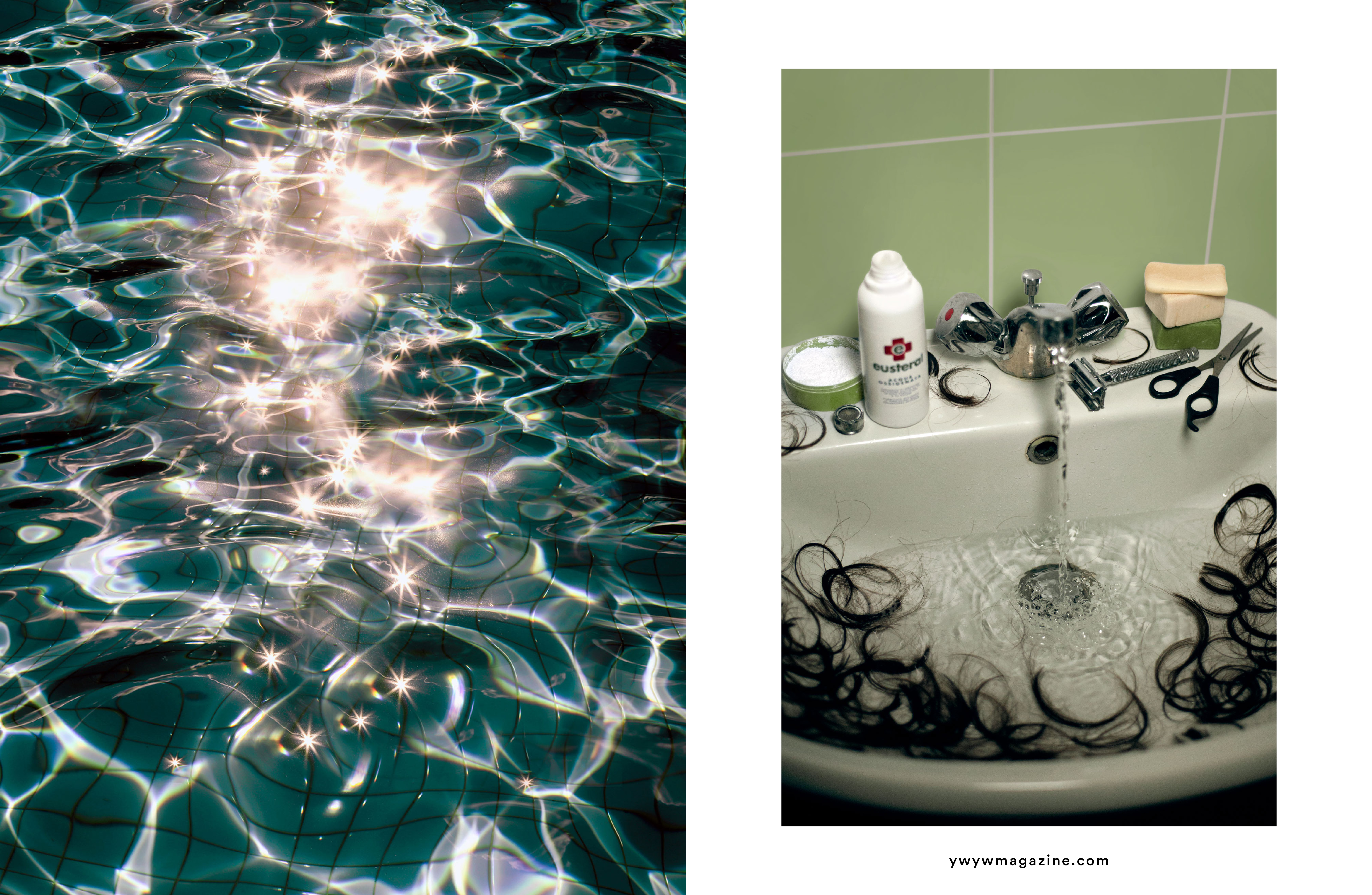
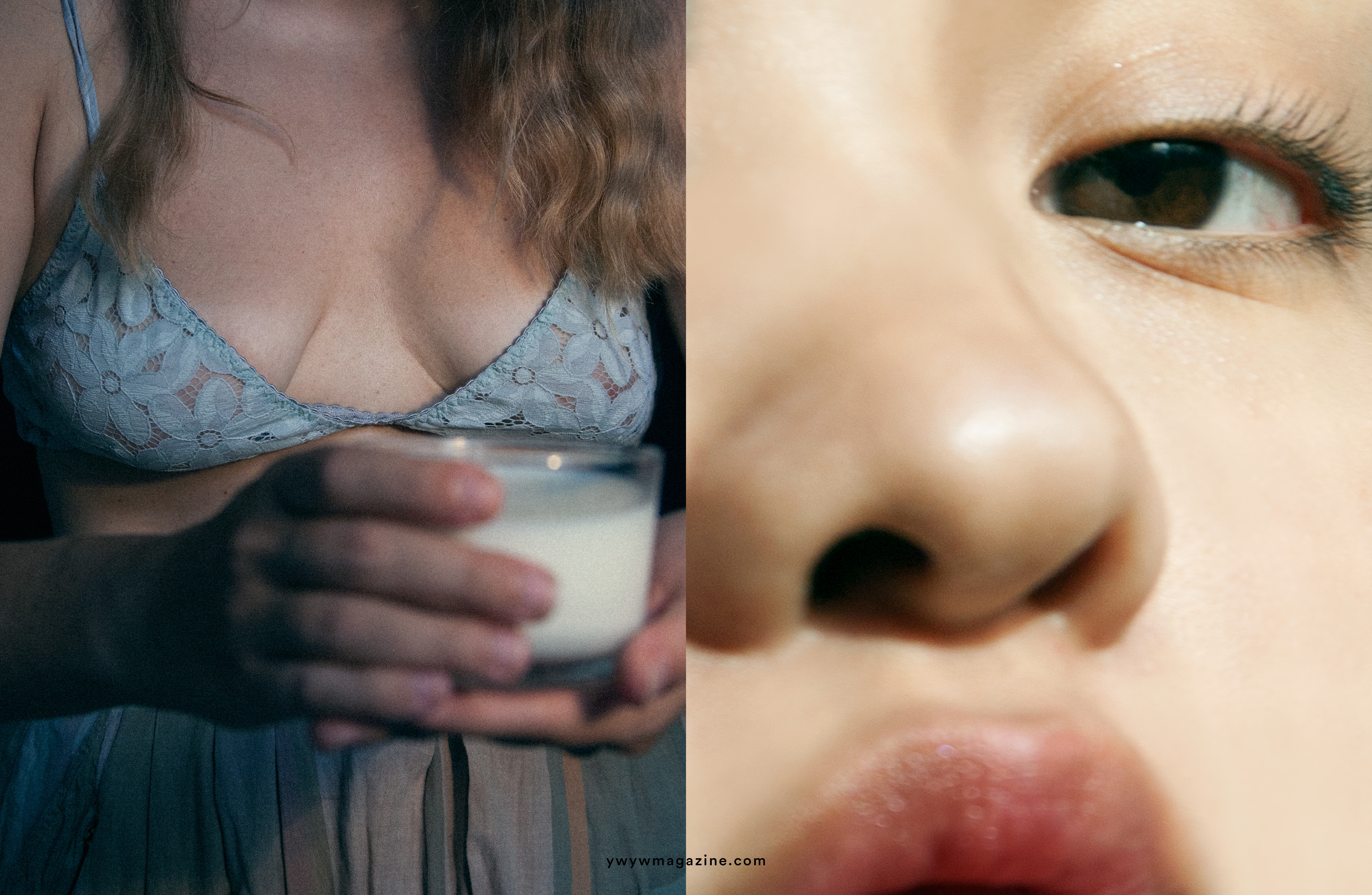
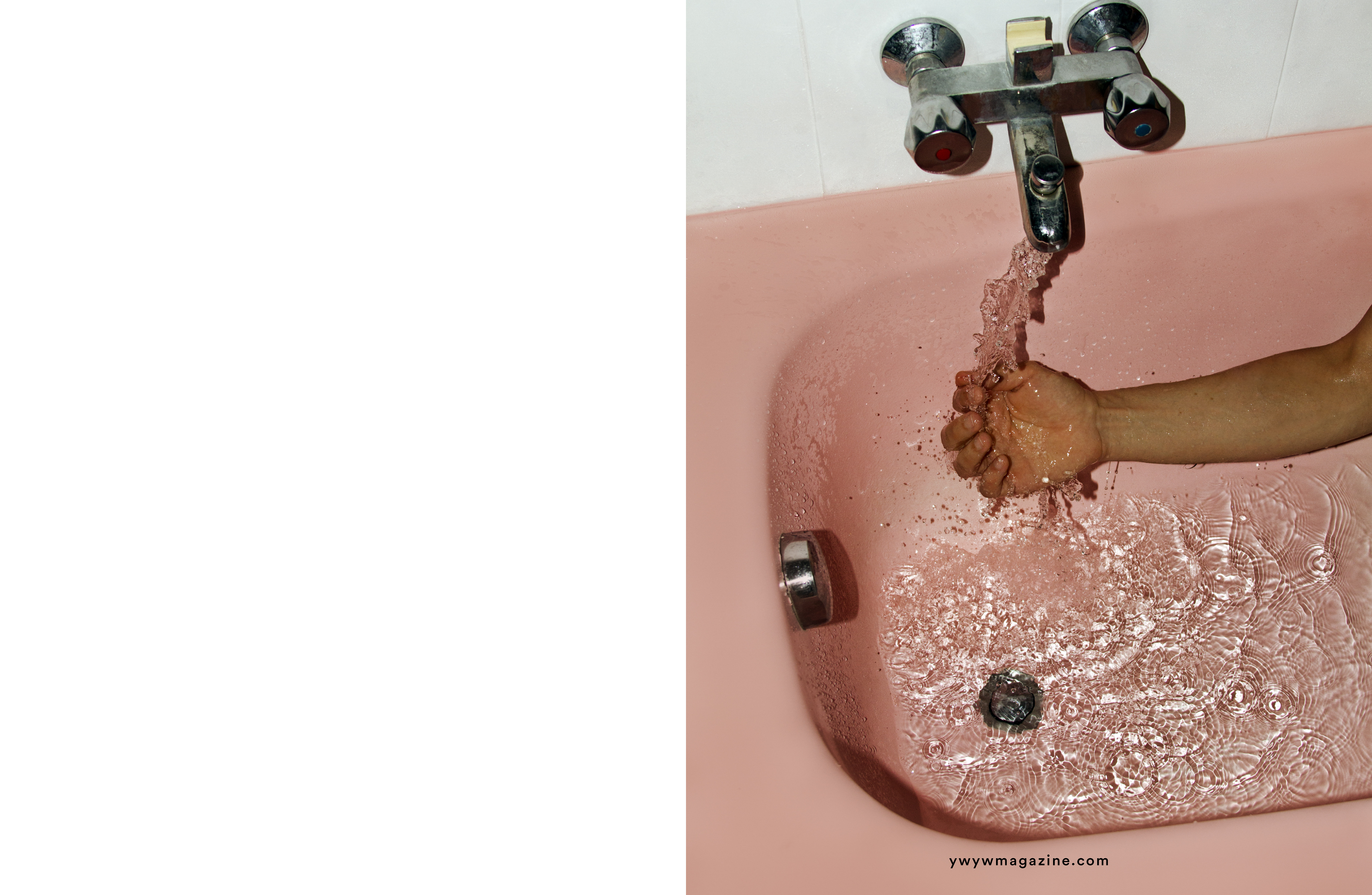
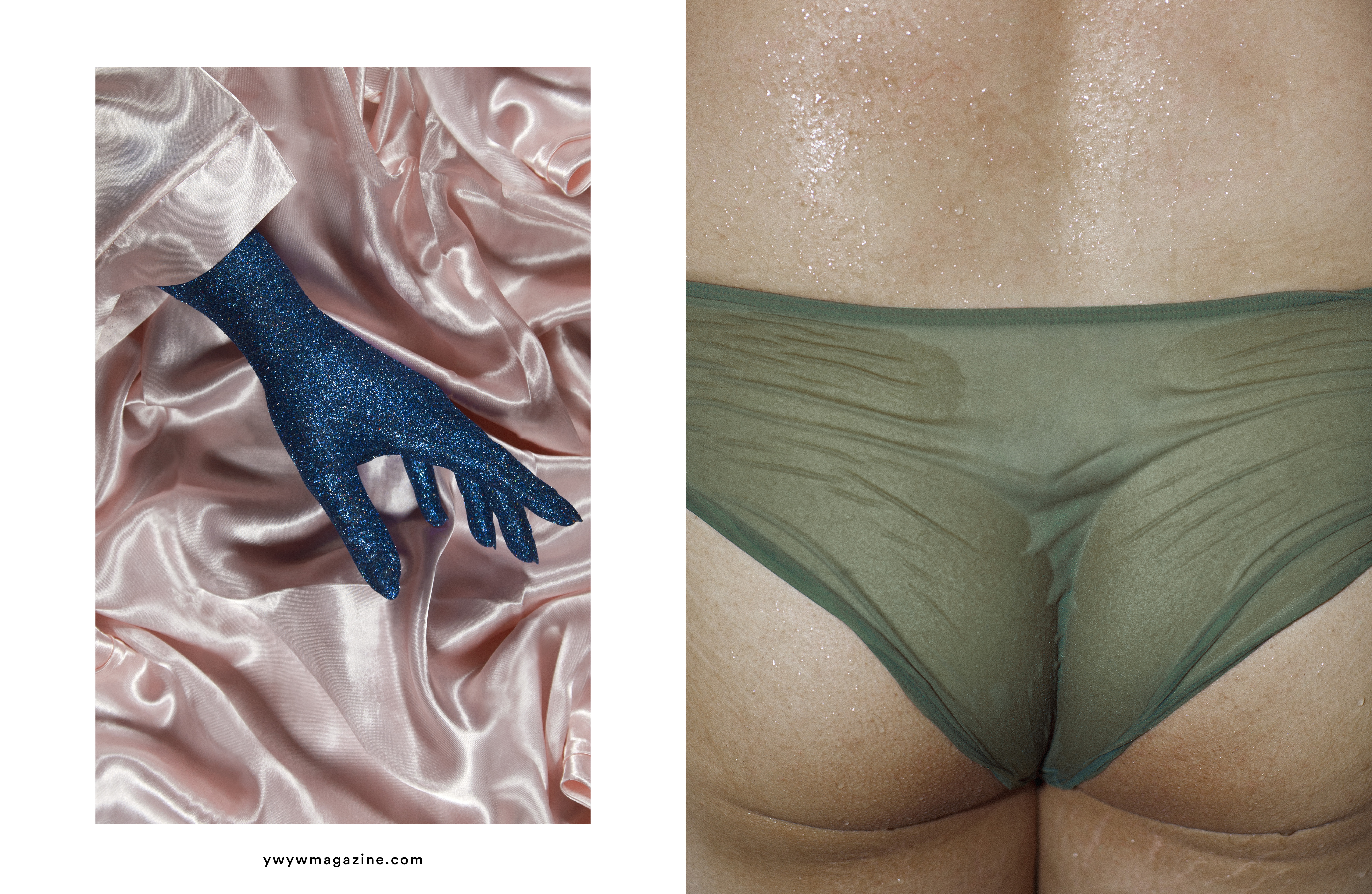
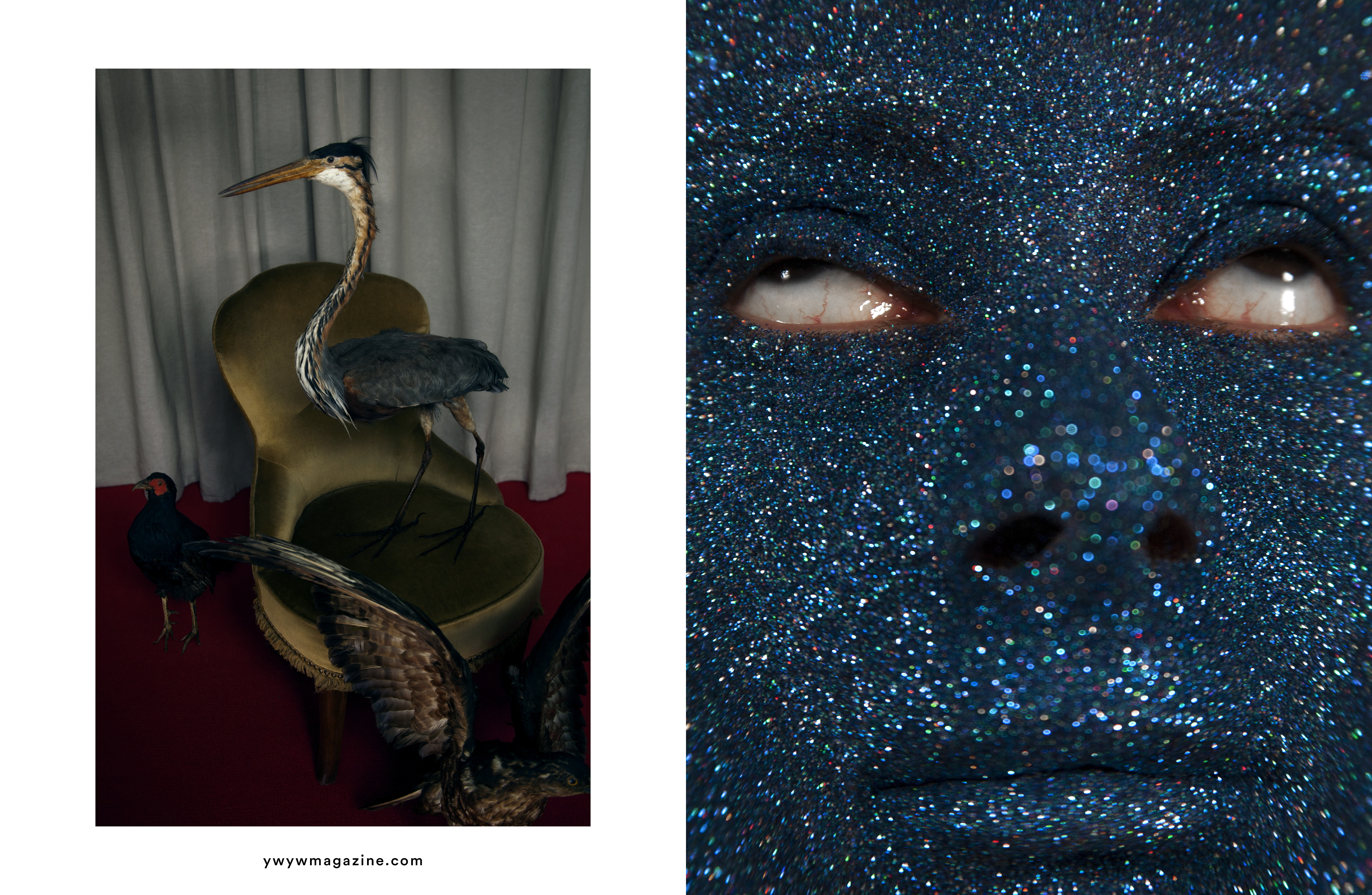
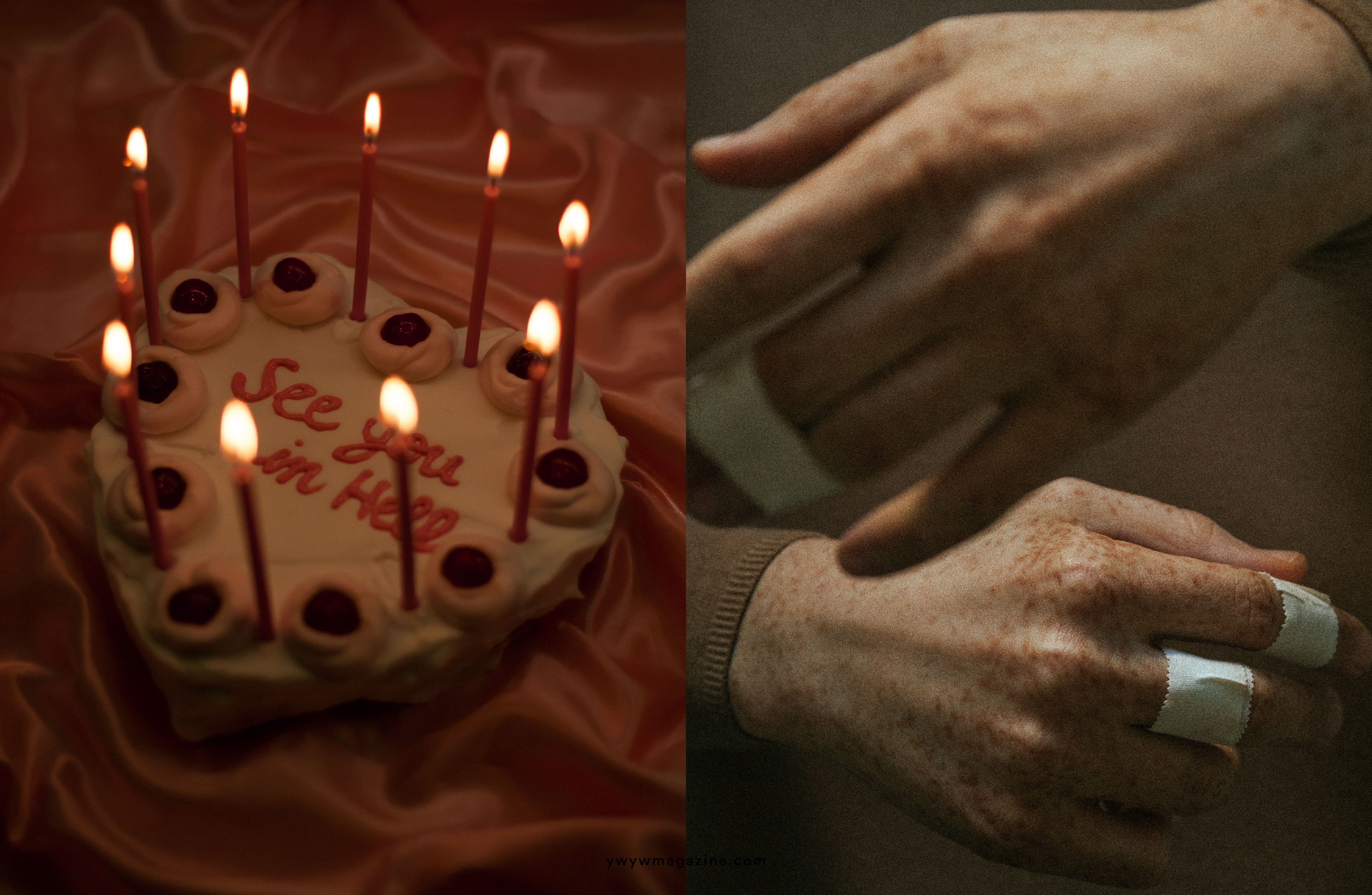
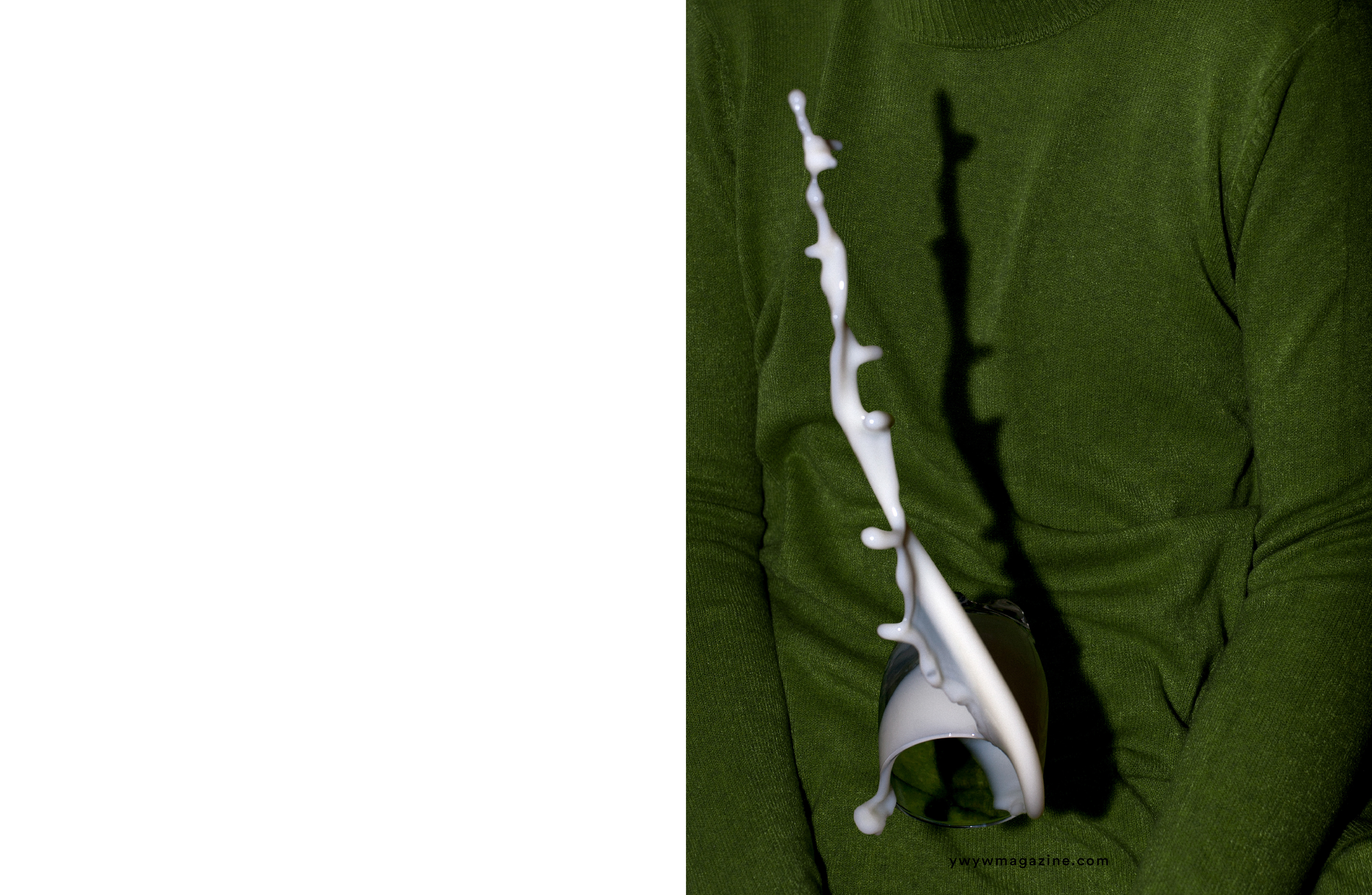
The photographs of this project are the prelude to a new project that I am developing in these months and which will have mental health as its main theme. This is an introspective journey in which I compare my emotions and try to bring out my fears. Darkness is colorful, for me, it is a collection of emotions, I tried to convey specific sensations through visually simple and well-defined images. I decided to combine dark and profound themes such as loneliness, abandonment and fear, with sparkling colors, glitter and colored lights. Because the intention is always to bring out the contrast between what is real and what you want to make believe it is real. All the images I made are designed, they are all constructed, there is nothing captured or random. And there is always a specific intention to provoke an emotional reaction or a memory. My work, especially in this project, is a constant research on themes filtered by the power of our memories and the effect they have on people. I tried to filter delicate and intimate topics with images with very strong references because I would like people to be rewarded visually, but also to recognize themselves in certain situations or emotions.
What is the meaning of the title?
Don’t trust what it looks like
When you are shooting how much of it is instinctual vs planned?
Almost everything is planned, always.
Which of your projects do you consider to be the best?
Darkness is colorful.
Do you have any ongoing work?
Yes, apart from the commercial works, I have various projects I’m working on, Ultraviolet is the project that I will explore this year.